
Some time ago, Eurostat tweeted this visualization of the 2017 regional unemployment rates in the European Union.
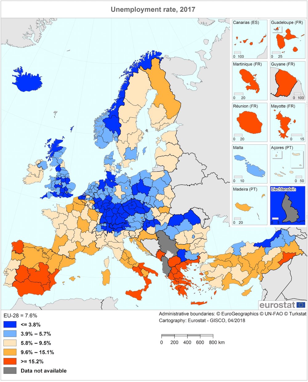
You can find links to the accompanying press release in English, French and German here.
While I found the data interesting, the way they were visualized got me thinking. How were those cutoffs chosen? Do they have any particular importance? And why choose these particular colors? My first impression was that they overemphasized the difference between unemployment rates above and below 5.8%. There is a stark (unfair?) visual difference between two regions that have unemployment rates of respectively 5.6 and 5.9%, while there is no visible difference between the first region with an unemployment rate of 5.6% and another one with a rate of 3.9%.
And finally, while I'm the first to admit that my geography is a bit rusty, I think it is unnecessarily hard to see the country borders, which I’m sure is one of the first things many people will look for (I did).
I wanted to recreate the graph so that it’s easier to interpret and less biased. I use R quite a lot in my day-to-day work, so I decided to go with that. I have included some code snippets in this post and you can find the complete script on GitHub.
First of all, I needed to get the data. Eurostat offers all its data through a publicly available web portal. As so often, I spent most of my time looking for the right dataset and working on the preprocessing, only to find the eurostat R package, which allows to you to download Eurostat data straight into R. Great! You still need to know the ID of your dataset though. I found the ID of the unemployment rate data (tgs00010) at the bottom of this very informative and detailed page: “Labour market statistics at regional level”.
Apart from the unemployment rates, the eurostat package also offers geospatial data, which I needed to draw a map of the so-called NUTS2 regions. I loaded the rworldmap package to plot the map and the rworldxtra package to create a Winkel tripel projection. I am utterly illiterate when it comes to map projections and chose this projection simply because it looked quite similar to the one used in the Eurostat tweet.
library(eurostat)
library(rworldmap)
library(rworldxtra)

# Load and explore the Eurostat unemployment rate data.
data = data.frame(get_eurostat('tgs00010'), stringsAsFactors=F)
# Select the most recent data for both men and women.
data = data[data$time == '2017-01-01' & data$sex == 'T',]
dim(data)
head(data)
summary(data$values)

# Load the map data, transform the projection and select the NUTS2 regions.
mapData = get_eurostat_geospatial(resolution=20)
mapData = spTransform(mapData, CRS('+proj=wintri'))
mapData = mapData[mapData$STAT_LEVL_ == 2,]
Now I had the unemployment and geospatial data. All that was left to do was to map the unemployment rate values to some colors and then draw the figure. In the excellent article “Mapping quantitative data to color” Nils Gehlenborg and Bang Wong write that “When plotting data with only positive or negative values, an intuitive encoding is a sequential color map that varies only the lightness from 10% to 100%. Such a color progression produces even transitions throughout the range.” [1] This is exactly what I needed for the unemployment data. The shift in color used in the Eurostat figure suggests that an unemployment rate of 5.8% has a special meaning and as far as I can see, it does not (the mean unemployment rate is 7.9% and the median is 5.9%). I followed the suggestion of Gehlenborg & Wong and mapped the unemployment rates to a single-color gradient that goes from light (low values) to dark (high values). As for the actual color, I like browsing colorhunt.co to find inspiration.
# Map the unemployment rate values to a color gradient.
mapCol = colorRampPalette(c('#e4eddb', '#1a3c40'))(30)
valueCol = vector()
naCol = '#fffffe'
for (i in 1:nrow(mapData)) {
	nutsID = as.character(mapData$NUTS_ID[i])
	# Check if the region (NUTS) ID is used in the unemployment data. If it is, we can
	# map it to a color. If it isn't we'll assign that region the "missing value" color.
	if (nutsID %in% data$geo) {
		value = data[data$geo == nutsID,]$values
		if (!is.na(value)) {
			valueIndex = floor(value)
			valueCol[i] = mapCol[valueIndex]
		} else {
			valueCol[i] = naCol
		}
	} else {
		valueCol[i] = naCol
	}
}
Unemployment rates, geospatial data and color gradient. Everything was now ready to draw the map.
# Draw the map.
png('unemployment.png', width=10, height=10, units='in', res=500)
par(oma=c(0,0,0,0), mar=c(0,0,0,0))
plot(mapData, col=valueCol, border=NA, bg='#fffffe', xlim=c(-1800000, 3900000), ylim=c(4500000, 7000000))
worldMap = getMap(resolution='high')
worldMap = spTransform(worldMap, CRS('+proj=wintri'))
plot(worldMap, add=T, border='#2c2c2c', lwd=0.25)
# Add a legend to the plot. The x and y values are the result of (a lot of) trial and
# error.
rect(-550000, 3050000, 2750000, 3700000, col='#fffffe', border='#2c2c2c', lwd=0.25)
for (i in 1:length(mapCol)) {
	rect(-500000 + i*100000, 3300000, -500000 + (i+1)*100000, 3400000, col=mapCol[i], border=NA)
}
text(-400000, 3550000, 'Unemployment rate', adj=c(0, 0.5), col='#2c2c2c', cex=1.2)
text(-400000, 3200000, '0%', adj=c(0.5,0.5))
text(600000, 3200000, '10%', adj=c(0.5,0.5))
text(1600000, 3200000, '20%', adj=c(0.5,0.5))
text(2600000, 3200000, '30%', adj=c(0.5,0.5))
dev.off()
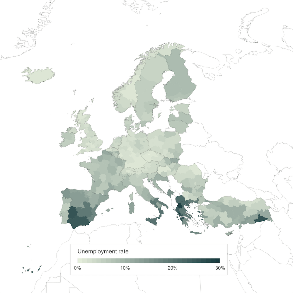
Not too bad, right? With some more time, I’m sure I could get the map projection right and add the extra boxes for the smallest countries and overseas territories. But I think this figure already presents a much fairer and more unbiased view of the data. Let me know what you think @monsieurKoch!
[1] This article is part of the fantastic “Points of view” series on data visualization published by the scientific journal Nature Methods. I highly encourage everyone to read through the whole series. It’s packed with great advice and best practices and has helped me create better data visualizations. ↑ back up