It's all in the font
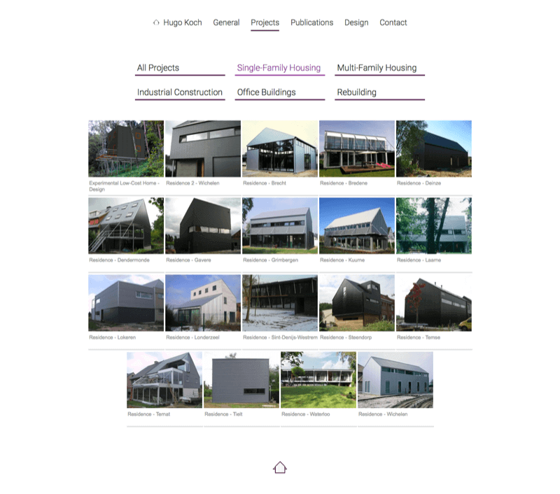
One of the main requirements for this website was readability. It also had to be multilingual (Dutch, English and French) and score as high as possible in google search results.
I opted for a bright design with legible font families, a big enough font size and enough color contrast. Dosis, font of the main title on the home page, refers to those letter stencils architects used back in the day when they still drew by hand. The purple touches on the other hand refer to the main color of the wall painting that decorates the office and are one of the few things that remain from the previous version of the website.
When it comes to search engine optimization or SEO, there are a lot of things to keep in mind. As always, I made sure I submitted the site to google's webmaster tools, that I included the appropriate meta tags with relevant content, that the site is responsive and so on. Google offers a detailed explanation of how you can improve your search result ranking here.

Un, deux, trois
This was my first multilingual website. I was debating whether to use a database to store the text in different languages or to simply recreate the pages in three different folders (one for Dutch, one for English and one for French). In the end, I decided to go for the latter. There aren't that many pages and the text will not have to be changed often, so it seemed faster and more straightforward to do it this way.
What I found most challenging was finetuning the search engine optimization. Ideally, the website would appear as the top search results when looking for architects specialized in steel construction. It's a never-ending story!
