a lean, mean, blogging machine
I created the Thought for Thoughts website for a good friend of mine who wanted to start a new blog. Rather than setting her up with a Wordpress site or another existing platform, I thought it would be an interesting challenge to try and build a blog myself.
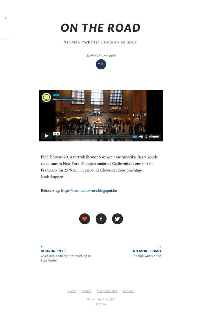
A blog is only as good as its content. With this in mind, I tried to come up with a very minimal design that—while looking good—would let a reader focus on the text. Typography is always important, but in situations like this it can really make a design stand out. I chose Lato, a sober and calm sans-serif font, for the headers and navigation and paired it with Crimson Text for the body copy. Crimson Text is a no-frills serif font, easy on the eyes and a good match for Lato.

svg, scalable vector goodness
A really useful bit of knowledge I picked up from working on this site was how awesome SVGs can be. When I started building the blog, I used PNGs for the logo and an icon font for the different icons (the little hearts and the facebook and twitter logos). Then two things happened.
I came across an excellent video by Chris Coyier on how easy it is to reduce page load by replacing certain images with SVGs and I noticed that older versions of Internet Explorer had problems displaying the icon font correctly. So I ditched my PNGs and gave SVGs a shot and it turned out really well! Browser support for SVGs is nearly perfect and I think they offer a very elegant solution.
